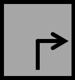
Lines of Questioning’s tiles used to look like this:

 These were simple, but only lovable by those who like black-and-white art as much as I do. Certainly they don’t do anything to sweep players into the thematic experience of the game.
With the rules for tile art in mind, I mocked up some new versions:

 Although these new tiles still won’t be mistaken for the work of a trained artist, I’m much happier with them. They’re far better at meeting the demands of the rules.
A tile’s gameplay implications must be clear: nothing could match the gameplay clarity of the arrows, but using grammar and punctuation to indicate which side is the start and which is the end is almost as good. In addition, the combination of highlight colors and differing fonts does an excellent job of distinguishing the lawyer’s questions from the witness’ answers. That was sometimes a problem with the old, monochromatic tiles. If there’s a loss here, it’s a small one.
Tile art should connect to the theme of the game: the new tiles are meant to call to mind a lawyer’s hastily-written notes and a witness’ answers recorded in the formal record. Whether they succeed is a decision I have to leave to the reader. 🙂 Even if they fall short, though, I think these are definitely superior to the arrows from a thematic standpoint.
Tiles must be visually interesting: using a paper texture rather than a plain background gives the new tiles a much more engaging look.
If the tiles will be played on top of something, their art must mesh attractively with that surface: since the board is still a work in progress, let’s bifurcate the trial and leave this issue for later.
The new design isn’t necessarily final; in particular, the board may necessitate a different approach. I thought it would be interesting to put these up, though, to show how the tiles are evolving as work on Lines of Questioning continues. When I think of the testing process, I always think of fiddling with the core gameplay. There are actually quite a few other levers that need to be pulled and positioned.
I see where you are coming from, but I greatly prefer the original tiles (:
To me the complex background, ‘paperness’, shadows, and font are just distracting. I would try to start with the original design and modify it slightly to indicate additional things if needed.
Interesting! That’s a very different reaction from what I expected.
Do you find that you disagree with the rules I’m using for tile art, or do you think the rules are right but the new tiles don’t follow them?
I agree with the “A tile’s gameplay implications must be clear” rule, but the other ones not as much.
I’m probably a unique case since I am more more functionally minded than visual minded, especially when graphs or graph-related things are involved. I prefer to focus on the raw geometrical relationships.
Though I should apologize since I didn’t read your games entire rule set (I skimmed it the other day) so I can’t contribute fully. But even w/o knowing all your games rules, I feel that the black/white original tiles are much, much easier on the eyes. To me the relationships and connections are what is important, and the simplest tiles which can represent that are likely bets.
Further playtesting has shown that you’re right about the new tiles having readability issues. I caught a few occasions where they were actually played backwards, which never happened with the arrows. They definitely need a better way to indicate the “flow” of the tile.
On the plus side, the colors did yeoman work in making the board easier to read. Even if the new tiles are completely scrapped, they’ve convinced me that the old tiles need to do more to differentiate questions and answers.
I’m curious: what do you think of Hearthstone’s card frames? CCG cards have to pack a lot of information into not a lot of space, so I’m considering looking more closely at them as a source of inspiration and lessons.
What do you mean by HS’s card “frames”, the actual frame (border) or you mean the entire card design itself? The frames themselves are not impressive but you probably mean the card design.
I don’t think the card designs are necessarily worth of using them as a source of inspiration, but they do showcase a good design which sets its priorities for what should be most visible. For example, the casting cost is made very visible using a combination of placement, color, font, and shapes. The card name is also central and usually pretty easy to read (the font is very straightforward).
The area behind the card name and description do have a texture, but the text is either white or black which makes it contrast well against the background.
One of the key parts of a HS card is the card image, which to me should be made so that it can be seen from far away, using a combination of unique colors and shapes. In that way the image is like a icon.