While trying to decide what Lines of Questioning’s tiles should look like, I realized that I was breaking my own cardinal rule: approach questions as though they were legal problems, and solve them using the tools provided by legal analysis. I’m not accustomed to doing that with graphic design issues, but there’s no reason why it shouldn’t work. So, let’s do the background research by looking at some cases–successful tile-laying games–and finding the rules that emerge from them.
Tsuro
Tsuro is a personal favorite of mine, and its path-building gameplay was an inspiration for Lines of Questioning. It’s an elegant design: players put a tile down in front of their pieces, and then move forward along the path they’ve created. Whoever can stay on the board longest, extending her path without running off its edge, wins.

I don’t have an artist’s trained eye, but Tsuro’s tiles strike me as both attractive and functional. The paths are easy to see, but there’s still some color, and the mottled backgrounds lend visual interest. Although the brown color scheme might seem drab in other games, here it feels–at least to me–relaxing. Tsuro bills itself as “beautiful and beautifully simple,” and I think these tiles capture that.
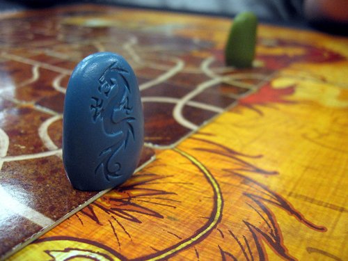
In addition, the tiles mesh well with the board. Their color scheme is consistent with what the board’s doing, but it’s still easy to tell where a tile has been placed.
Carcassonne
A tile-laying classic, Carcassonne is an area-control game in which players create the areas to be controlled on the fly. There’s no board, and the other game pieces (at least when playing without expansions) are simple meeples, so the tiles have to do a lot of heavy lifting. Both the aesthetics and the gameplay ride on them.

Carcassonne’s tiles are more cheerful than Tsuro’s, but they have the same clarity. One is never confused about a road’s path or which sides of the tile are part of a castle. They also have something going on in the background; farmland and castle both have some texture, rather than simply being “green space” and “brown space.”
Everything is also consistent with what one might expect of a medieval city. There are monasteries, walled fortresses, roads, farms. Expansions add things like rivers. At the end of the game, the tableau looks appropriate for the period.
Suburbia
Like Carcassonne, Suburbia has players lay tiles to build a city. Absolutely everything else about the games is completely different. 😉 Nevertheless, some similar principles underlie the design of their tiles.
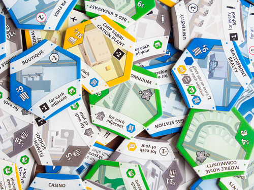
Both games have thematically appropriate artwork, although in Suburbia’s case this means modern buildings rather than medieval ones. They also share an emphasis on ease of reading during play; Suburbia’s tiles are more complex than Carcassonne’s, but the use of bright colors and easily-recognized icons still allows them to be taken in at a glance. Finally, Suburbia follows Carcassonne’s lead in avoiding dead space on the tiles, filling the center area with art and minimizing the swathes of plain color.
There are many more excellent tile-laying games, but I think the rules are becoming clear. Part of being a good legal researcher is knowing when to stop.
1. A tile’s gameplay implications must be clear. Tsuro, Carcassonne, and Suburbia all put gameplay first in their tiles. There is never any ambiguity about whether this connects to that, or which tiles do what. When tiles are central to the game, as they are in these cases, the tile needs to support the game’s play and foremost.
2. Tile art should connect to the theme of the game. Carcassonne and Suburbia both reinforce their city-building themes with tiles that look like parts of a city. Tsuro’s art is simpler, but appropriate for an abstract.
3. Tiles must be visually interesting. None of the tiles here have plain backgrounds. Whether it’s Carcassonne’s grassy fields, Suburbia’s colorful expanses, or Tsuro’s muted earth, variation and texture are used to keep the entire tile engaging.
4. If the tiles will be played on top of something, their art must mesh attractively with that surface. Tsuro looks as good as it does, not just because it has great tiles (though it does), but because the tiles and the board work together to give the game an appealing overall look.
Applying those rules to Lines of Questioning, it instantly becomes clear that the very simple tiles are out. They’re clear, yes, but they’re athematic and boring to look at. More attractive tiles will benefit the game a great deal. I’ll have some ready for next time.
