When one follows a rule and gets a shaky result, one of two things has happened. The first possibility is that there was a misstep; the rule wasn’t actually followed. The other is that something is wrong with the rule. Looking back at the rules for tile art, I think the latter led to the failings of Lines of Questioning’s new tiles, which proved confusing in play. Rule #1–that a tile’s gameplay has to be clear–provided a goal without any indication as to how one might achieve it or how one could tell it had been achieved. As a result, I was unable to judge accurately whether its dictates had been met. Crafting a more detailed rule should help avoid similar mistakes in the future.
“A tile’s gameplay implications must be clear” sounded like a great rule–and so far as it goes, I think it is. Game pieces are, by definition, part of a game. They need to function within that environment.
However, the rule is ultimately question-begging. How does one make gameplay clear? What steps should be taken to make gameplay stand out as art is incorporated into the design?
Thinking about this reminded me of some upheaval in Legend of the Five Rings’ graphic design, and I think there are valuable lessons there. When the game first game out, Legend of the Five Rings’ cards looked like this:
 I’ve always liked this design a great deal. Its border has the monochromatic aspect I like, even if the major color is red rather than black. The lantern, diamond, and circle . . . well, it’s not really clear what they mean, but they’re individually pretty. Using a bronze gradient for the text gives the impression of a plaque, lending a sense of place and permanence that (for me, at least) creates a feeling that this is somewhere important.
Legend of the Five Rings was later bought by Wizards of the Coast (of Magic: the Gathering fame). Under Wizards the card design changed significantly:
 The background is still textured, but the new stone look is simpler, and the card text is now on plain slate. Perhaps the biggest difference, though, is the numbers: the geometric shapes are gone in favor of a gold coin and a flag that give some sense of what the numbers might mean.
I no longer have the link, but my memory is that a Wizards employee explained that these changes were based on internal focus testing. Players, especially new players, expressed that the old cards were too busy and did too little to indicate what the various numbers meant. The new design was meant to be attractive, but also clear in play.
While I don’t enjoy this look as much from an aesthetic perspective, I can’t deny that it has advantages as a design for game pieces. The text is much easier to read, the numbers are contained in pictures that serve as a shorthand reminder of their meanings, and the game-relevant aspects of the card stick out from the background.
All of this happened years ago (and L5R’s cards have changed again in the years since), but I think this is an interesting case to look at because of how clearly the intent behind the update shows through. There’s still art involved in the cards–a great deal of it–but the focus of attention has shifted. Where the old cards were all about the bold, atmospheric border, the new ones draw the eye toward clear black-on-white text and numbers identified by icons.
The importance of those changes is reinforced, I feel, by the cards used by the still very new Hearthstone:
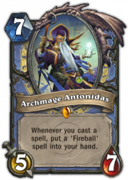 Archmage Antonidas here is pretty elaborate–but it’s not hard to figure him out. The background is textured (interesting how we keep running into “broken stone”) and colorful, but it doesn’t demand attention. Having one number in a sword, and another in a drop of blood, suggests their functions even to those who have never played the game. Another number in a gem is harder to parse, but the gem correctly indicates that it has something to do with the card’s value. Text is large, on a very simple background.
Each of these elements–artistic but “quiet” background, attention-grabbing and useful iconography for key gameplay elements like numbers, high contrast between text and the surface it’s on–follows the same course as the updated Legend of the Five Rings cards. One hardly imagines that that’s an accident.
I see those same elements in Suburbia’s tiles:
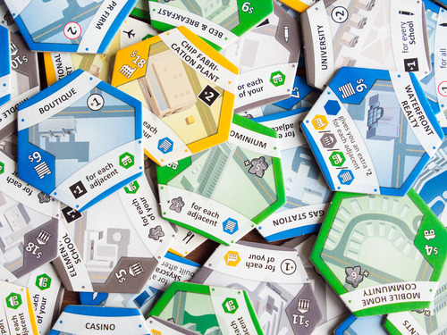
All of these tiles have a background–a picture of the building the tile represents–but it’s done in muted colors that don’t pull focus away from the text. That text is black on plain white banners stretched across the art, and is presented in conjunction with meeples and building shapes that tie into the game’s rules.
Simple background, easy-to-read text, icons that are useful and draw the eye; these seem to be consistent themes. They should be the basis for new, more detailed rules regarding the interaction between tile art and gameplay:
1. A tile’s background must not distract from gameplay elements.
2. Text on tiles must be easy to read.
3. Key gameplay elements should be highlighted with art that reminds the player of their functions.
Where the new tiles seemed to pass the old rule’s muster, these new rules make it clear that they’re not going to work–and why. The background is bright and busy, competing with the lines for attention. Even worse is relying solely on the text to indicate which side of the tiles is which; periods are not nearly as attention-grabbing as Legend of the Five Rings’ gold coins, Hearthstone’s swords and gems, or Suburbia’s meeples. If I’d had these rules when working on the new tiles, I could have predicted that they would have problems in play.
Another update to the tiles is still in the works. In the interim, here’s hoping that these rules help you dial in the art for your projects without wandering in the woods like I have. 🙂

One thought on “Theory: Revisiting the Rules for Tile Art”