Identifying an issue–creating a board game that works even when a toddler messes with the pieces–is just the first step. The next and more difficult phase is finding rules that will guide the work.
Since most board games don’t (and, to be fair, were never meant to) account for the possibility of a two-year-old moving things around, I haven’t come up with many helpful examples to learn from. As a result, this will be a largely theoretical exercise. I’m interested to hear your views on what I’ve come up with, what should be included here that I missed, and on games that I should be thinking about.
Without further ado:
The game must be safe: this is perhaps obvious, but obvious things can be overlooked when they’re not made an explicit part of the process. Any game that’s meant to be resilient when kids interact with it also has to be safe for the kids. “This game is proof against children–because it’s MADE OF LAVA!!!!!” is not OK.
Damage should be irrelevant to the design: very small children play rough; it’s inevitable when they’re still learning fine motor control. Any game designed with the expectation that toddlers will interact with it needs to be able to handle having its components knocked around. This might be accomplished through making the components sturdy enough not to be damaged, or it might involve designing the game to take battered components into account.
Position cannot be required to remain constant: many if not most turn-based games assume that pieces will remain in place from round to round. (How many rulebooks specifically say “don’t pick up your pieces?”) That assumption doesn’t hold when there’s a toddler present. For a game to work while within arm’s reach of a small child, it has to be able to continue after the pieces are jostled.
Every piece is optional: kids are natural collectors; toddlers will gather whatever pieces the adults are playing a board game with so that they can play, too. Since they aren’t actually playing the game (or at least, are playing a different game–“gather these interesting things”), this tends to lead to an ever-growing number of pieces being taken out of circulation. Our hypothetical game therefore can’t rely on its components being available. The rules have to allow the players to keep going with an unpredictable set of the game’s pieces missing.
These rules present some really fascinating challenges. What kind of board game doesn’t need its components? What should the pieces be made of? I won’t be stopping development of Over the Next Dune or Lines of Questioning to work on this, but I’ll be coming back to it from time to time. Problems this interesting shouldn’t be left by the wayside!
I’m accustomed to thinking about game design projects in terms of goals I set for myself: I want to make a game that’s about this, or works like that. As an attorney, though, my “projects”–cases–were driven by the client’s needs rather than what I was interested in. This past weekend I was reminded that that’s a valid approach to game design as well, and I saw some clients that I really want to help out. I want to build a game that works for people with toddlers.
Here are the facts of the case. I visited some friends of many years. They’re board gamers–the engineer and one of the law students from this story, as it happens. In addition, they have a two-year-old.
(Parents who are reading this already see the problem.)
It turns out that playing board games while taking care of a toddler is a challenge. Now, their child is very well-behaved. Two-year-olds, though, can’t resist colorful game pieces–and my friends’ daughter is no exception. They tend to pile up around her as she collects people’s cards and meeples.
This is just about the cutest thing in the world, but it makes playing Galaxy Trucker, or even a party game like Apples to Apples, tricky. Secret information gets revealed and pieces get moved when a toddler is around. The game state is constantly subject to change.
Watching my friends balance letting their child participate against keeping the game going made me realize how badly we need board games that work with new parents rather than against them. The vast majority of board games only function if small children are kept at a distance. That’s fine so far as it goes, but it means that most games can’t reach the table when there’s a toddler in the house. It would be great if we could design more board games that are suitable for play in the presence of small children; games that are interesting for the adults at the table, but that are resilient and can handle the child taking an interest in them.
My first thought, inspired by the cheerful destruction at the table, was a game about cleaning up after a natural disaster, with the child taking the role of the disaster. One of my friends suggested a game centered around a mobile that the child could spin and play with. I still like both of those ideas, but I feel like there’s so much more that could be done here. Kids don’t just whack game pieces; they move them, gather them, and even walk away from the table to play games of their own devising with them. It would be amazing if a game could take advantage of that creativity.
I haven’t had the chance to think too much about this over the week to date, but I think it’s a fascinating topic and I aim to explore it further. You have, as part of your game, a completely unpredictable player who is not subject to any rules. How does that game work?
Just a small update for today: I’m experimenting with chipboard as a prototyping material. It should prove sufficiently strong to serve as a material for Lines of Questioning’s tiles, while being thin enough that the stacks of questions and answers are each a reasonable height.
Unfortunately, working with chipboard has required picking up some equipment and developing new muscle memory. All of that has taken time away from the more theoretical aspects of design, and made for this rather drab post. ;)I have a topic in mind for Wednesday, though, that I think is absolutely fascinating . . . .
When one follows a rule and gets a shaky result, one of two things has happened. The first possibility is that there was a misstep; the rule wasn’t actually followed. The other is that something is wrong with the rule. Looking back at the rules for tile art, I think the latter led to the failings of Lines of Questioning’s new tiles, which proved confusing in play. Rule #1–that a tile’s gameplay has to be clear–provided a goal without any indication as to how one might achieve it or how one could tell it had been achieved. As a result, I was unable to judge accurately whether its dictates had been met. Crafting a more detailed rule should help avoid similar mistakes in the future.
“A tile’s gameplay implications must be clear” sounded like a great rule–and so far as it goes, I think it is. Game pieces are, by definition, part of a game. They need to function within that environment.
However, the rule is ultimately question-begging. How does one make gameplay clear? What steps should be taken to make gameplay stand out as art is incorporated into the design?
Thinking about this reminded me of some upheaval in Legend of the Five Rings’ graphic design, and I think there are valuable lessons there. When the game first game out, Legend of the Five Rings’ cards looked like this:
I’ve always liked this design a great deal. Its border has the monochromatic aspect I like, even if the major color is red rather than black. The lantern, diamond, and circle . . . well, it’s not really clear what they mean, but they’re individually pretty. Using a bronze gradient for the text gives the impression of a plaque, lending a sense of place and permanence that (for me, at least) creates a feeling that this is somewhere important.
Legend of the Five Rings was later bought by Wizards of the Coast (of Magic: the Gathering fame). Under Wizards the card design changed significantly:
The background is still textured, but the new stone look is simpler, and the card text is now on plain slate. Perhaps the biggest difference, though, is the numbers: the geometric shapes are gone in favor of a gold coin and a flag that give some sense of what the numbers might mean.
I no longer have the link, but my memory is that a Wizards employee explained that these changes were based on internal focus testing. Players, especially new players, expressed that the old cards were too busy and did too little to indicate what the various numbers meant. The new design was meant to be attractive, but also clear in play.
While I don’t enjoy this look as much from an aesthetic perspective, I can’t deny that it has advantages as a design for game pieces. The text is much easier to read, the numbers are contained in pictures that serve as a shorthand reminder of their meanings, and the game-relevant aspects of the card stick out from the background.
All of this happened years ago (and L5R’s cards have changed again in the years since), but I think this is an interesting case to look at because of how clearly the intent behind the update shows through. There’s still art involved in the cards–a great deal of it–but the focus of attention has shifted. Where the old cards were all about the bold, atmospheric border, the new ones draw the eye toward clear black-on-white text and numbers identified by icons.
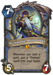
The importance of those changes is reinforced, I feel, by the cards used by the still very new Hearthstone:
Archmage Antonidas here is pretty elaborate–but it’s not hard to figure him out. The background is textured (interesting how we keep running into “broken stone”) and colorful, but it doesn’t demand attention. Having one number in a sword, and another in a drop of blood, suggests their functions even to those who have never played the game. Another number in a gem is harder to parse, but the gem correctly indicates that it has something to do with the card’s value. Text is large, on a very simple background.
Each of these elements–artistic but “quiet” background, attention-grabbing and useful iconography for key gameplay elements like numbers, high contrast between text and the surface it’s on–follows the same course as the updated Legend of the Five Rings cards. One hardly imagines that that’s an accident.
All of these tiles have a background–a picture of the building the tile represents–but it’s done in muted colors that don’t pull focus away from the text. That text is black on plain white banners stretched across the art, and is presented in conjunction with meeples and building shapes that tie into the game’s rules.
Simple background, easy-to-read text, icons that are useful and draw the eye; these seem to be consistent themes. They should be the basis for new, more detailed rules regarding the interaction between tile art and gameplay:
1. A tile’s background must not distract from gameplay elements.
2. Text on tiles must be easy to read.
3. Key gameplay elements should be highlighted with art that reminds the player of their functions.
Where the new tiles seemed to pass the old rule’s muster, these new rules make it clear that they’re not going to work–and why. The background is bright and busy, competing with the lines for attention. Even worse is relying solely on the text to indicate which side of the tiles is which; periods are not nearly as attention-grabbing as Legend of the Five Rings’ gold coins, Hearthstone’s swords and gems, or Suburbia’s meeples. If I’d had these rules when working on the new tiles, I could have predicted that they would have problems in play.
Another update to the tiles is still in the works. In the interim, here’s hoping that these rules help you dial in the art for your projects without wandering in the woods like I have. 🙂
The last few days have seen a lot of behind-the-scenes work on Lines of Questioning’s art, in addition to the conversation in the comments to the previous post. (Special thanks to locksleyu for the feedback!) I don’t have new art to show yet, but things are happening on this front, and I hope to have a new set of tiles that are both attractive and more readable soon.
Part of the challenge with the tiles is that there’s a balancing test involved. Aesthetics and gameplay clarity are both important, but they don’t always pull in the same direction. When they don’t one has to decide how much weight each should be given. It’s never easy to do that, especially when dealing with non-quantitative factors like “how nice does this look” and “how easy is this to read at a glance.”
This is, unfortunately, an area where legal principles can’t offer much help. Balancing tests are common in the law, and they are just as much of a challenge there as here. Different judges will look at the same facts, apply the same balancing test, and come up with different conclusions–all of which are reasonable, defensible, and in some sense “right.”
Of course, sometimes it becomes clear that the balancing test was applied wrongly, and that’s happened here. (See the comments to the previous post for more details.) Time to file the appeal . . . .
Lines of Questioning’s tiles used to look like this:
These were simple, but only lovable by those who like black-and-white art as much as I do. Certainly they don’t do anything to sweep players into the thematic experience of the game.
Although these new tiles still won’t be mistaken for the work of a trained artist, I’m much happier with them. They’re far better at meeting the demands of the rules.
A tile’s gameplay implications must be clear: nothing could match the gameplay clarity of the arrows, but using grammar and punctuation to indicate which side is the start and which is the end is almost as good. In addition, the combination of highlight colors and differing fonts does an excellent job of distinguishing the lawyer’s questions from the witness’ answers. That was sometimes a problem with the old, monochromatic tiles. If there’s a loss here, it’s a small one.
Tile art should connect to the theme of the game: the new tiles are meant to call to mind a lawyer’s hastily-written notes and a witness’ answers recorded in the formal record. Whether they succeed is a decision I have to leave to the reader. 🙂 Even if they fall short, though, I think these are definitely superior to the arrows from a thematic standpoint.
Tiles must be visually interesting: using a paper texture rather than a plain background gives the new tiles a much more engaging look.
If the tiles will be played on top of something, their art must mesh attractively with that surface: since the board is still a work in progress, let’s bifurcate the trial and leave this issue for later.
The new design isn’t necessarily final; in particular, the board may necessitate a different approach. I thought it would be interesting to put these up, though, to show how the tiles are evolving as work on Lines of Questioning continues. When I think of the testing process, I always think of fiddling with the core gameplay. There are actually quite a few other levers that need to be pulled and positioned.
While trying to decide what Lines of Questioning’s tiles should look like, I realized that I was breaking my own cardinal rule: approach questions as though they were legal problems, and solve them using the tools provided by legal analysis. I’m not accustomed to doing that with graphic design issues, but there’s no reason why it shouldn’t work. So, let’s do the background research by looking at some cases–successful tile-laying games–and finding the rules that emerge from them.
Tsuro
Tsuro is a personal favorite of mine, and its path-building gameplay was an inspiration for Lines of Questioning. It’s an elegant design: players put a tile down in front of their pieces, and then move forward along the path they’ve created. Whoever can stay on the board longest, extending her path without running off its edge, wins.
I don’t have an artist’s trained eye, but Tsuro’s tiles strike me as both attractive and functional. The paths are easy to see, but there’s still some color, and the mottled backgrounds lend visual interest. Although the brown color scheme might seem drab in other games, here it feels–at least to me–relaxing. Tsuro bills itself as “beautiful and beautifully simple,” and I think these tiles capture that.
In addition, the tiles mesh well with the board. Their color scheme is consistent with what the board’s doing, but it’s still easy to tell where a tile has been placed.
Carcassonne
A tile-laying classic, Carcassonne is an area-control game in which players create the areas to be controlled on the fly. There’s no board, and the other game pieces (at least when playing without expansions) are simple meeples, so the tiles have to do a lot of heavy lifting. Both the aesthetics and the gameplay ride on them.
Carcassonne’s tiles are more cheerful than Tsuro’s, but they have the same clarity. One is never confused about a road’s path or which sides of the tile are part of a castle. They also have something going on in the background; farmland and castle both have some texture, rather than simply being “green space” and “brown space.”
Everything is also consistent with what one might expect of a medieval city. There are monasteries, walled fortresses, roads, farms. Expansions add things like rivers. At the end of the game, the tableau looks appropriate for the period.
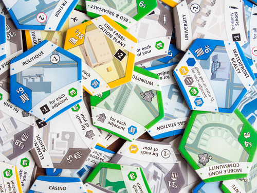
Suburbia
Like Carcassonne, Suburbia has players lay tiles to build a city. Absolutely everything else about the games is completely different. 😉 Nevertheless, some similar principles underlie the design of their tiles.
Both games have thematically appropriate artwork, although in Suburbia’s case this means modern buildings rather than medieval ones. They also share an emphasis on ease of reading during play; Suburbia’s tiles are more complex than Carcassonne’s, but the use of bright colors and easily-recognized icons still allows them to be taken in at a glance. Finally, Suburbia follows Carcassonne’s lead in avoiding dead space on the tiles, filling the center area with art and minimizing the swathes of plain color.
There are many more excellent tile-laying games, but I think the rules are becoming clear. Part of being a good legal researcher is knowing when to stop.
1. A tile’s gameplay implications must be clear. Tsuro, Carcassonne, and Suburbia all put gameplay first in their tiles. There is never any ambiguity about whether this connects to that, or which tiles do what. When tiles are central to the game, as they are in these cases, the tile needs to support the game’s play and foremost.
2. Tile art should connect to the theme of the game. Carcassonne and Suburbia both reinforce their city-building themes with tiles that look like parts of a city. Tsuro’s art is simpler, but appropriate for an abstract.
3. Tiles must be visually interesting. None of the tiles here have plain backgrounds. Whether it’s Carcassonne’s grassy fields, Suburbia’s colorful expanses, or Tsuro’s muted earth, variation and texture are used to keep the entire tile engaging.
4. If the tiles will be played on top of something, their art must mesh attractively with that surface. Tsuro looks as good as it does, not just because it has great tiles (though it does), but because the tiles and the board work together to give the game an appealing overall look.
Applying those rules to Lines of Questioning, it instantly becomes clear that the very simple tiles are out. They’re clear, yes, but they’re athematic and boring to look at. More attractive tiles will benefit the game a great deal. I’ll have some ready for next time.
Right now Lines of Questioning uses simple tiles with prominent arrows. They’re unexciting, but very easy to read during play.
When I first had the idea that’s evolved into Lines of Questioning, I envisioned tiles that were a little more interesting. They would actually have a line of questioning on them, with the text indicating where the tile began and ended. Something like this:
As I work on the game, I’ve become torn on this kind of tile. On the one hand, these bring more thematic power, and theme is central to Lines of Questioning. On the other hand, the arrows have an immediate clarity that text lacks. Players will have to invest more effort in processing these tiles, and may not find it easy to tell where the line ends when the board state is complex.
My preferences in art run toward ink paintings, pencil sketches, and other monochromatic works, so I know that I have a pre-existing bias toward the bold, black-and-while arrows that might be coloring my opinion. For that reason–and because I’m not a graphic designer, and am far outside my comfort zone–I’d like to throw the question of the tiles open for discussion. Arrows? Words? More color? Less? Let me know what you think.
I have a confession to make: I like hit points as a mechanic. They’re quick to explain, easy to understand, tracking them is effortless, and–since there’s generally no negative consequence to losing hit points until they run out–there’s no death spiral as the player gets hit. Hit points even provide an easy way to pace combat; with knowledge of how quickly the player can remove them, designers can give the opponent just enough hit points to make the fight a satisfying length without turning it into a grind. Designers looking for simple, readily tunable combat systems can find hit points to be just what they need.
There is, however, a right way and a wrong way to implement them. Ironically, the Star Wars: Knights of the Old Republic series has done both.
Hit points done right: hit points working in tandem with the fiction
Two important things happen in this clip. Keep one eye on the lightsabers, and the other on Juhani’s health bar.
One of the fundamental rules of Star Wars combat, as it’s demonstrated in the films, is that getting cut by a lightsaber is incredibly bad. Just by nicking Darth Vader’s arm, Luke made the Dark Lord of the Sith cry out; whenever someone really got chopped, the fight ended right then and there. Being struck by a lightsaber is devastating.
That creates a problem for game designers trying to fit Star Wars combat into the hit point mold. If any hit from a lightsaber instantly reduces the opponent to zero hit points, fights will be brief and potentially anticlimactic. On the other hand, making lightsaber blows less serious detracts from the game’s immersiveness.
(At this point one might conclude that the solution is “use a combat system not based on hit points.” That would be a reasonable road to go down. Let’s assume, however, that the game’s design is such that the benefits of a hit point system outweigh its flaws.)
KOTOR’s designers escaped their dilemma by making the game’s hit points more about endurance than about health, and then matching the animations to that understanding. Juhani loses hit points in the video as she parries the player’s attacks, but she doesn’t get hit; the player never lands the big chop that every Star Wars fan knows would be instantly fatal. The hit point system is deployed in a way that makes sense within the game’s fiction.
In fact, KOTOR’s designers went beyond merely solving problems with hit points; they used the hit point system enhance the story. Juhani concedes the duel with some hit points left. Since KOTOR players learn early on that zero hit points equals death, stopping the fight before that point clearly signals that this battle has reached an unexpected non-lethal conclusion. The player blinks and has to reorient just like the player’s character has to check his or her lightsaber swing.
This, then, is how hit points are done right. Implemented in accordance with the game’s theme, and used imaginatively to get emotional responses from the player, hit points become a seamless part of KOTOR’s overall Star Wars experience.
Hit points done wrong: a mechanism in a vacuum
Compare the previous clip to this one:
This fight is nothing but big chops, with the occasional tremendous lunge thrown in. Each and every move should instantly fell the opponent . . . but instead the battle goes on and on, the players shrugging off lightsaber blows as though they were hitting each other with foam swords.
Hit points, implemented in this way, are nothing but a technical measure of progress. They add nothing to the immersion; to the contrary, they undermine it by allowing the players to keep fighting long after the rules of the fictional universe would permit. In a role-playing game that’s all about losing oneself in a story, that is a cardinal sin.
Don’t catch yourself on your double-bladed lightsaber
In the end, hit points are like a hammer: useful when employed thoughtfully, damaging when applied incorrectly. When incorporating them into a game, give due consideration to how they can be implemented so that they are both mechanically effective and thematically appropriate. KOTOR proves that it can be done . . . and that it’s important to get it right.
There’s a lot of costuming that goes into being a lawyer. Attorneys have differing opinions on what to wear in the courtroom; some want an extremely conservative, formal look that can’t offend anyone, while others aim toward a striking appearance that makes one the center of attention. Much effort is put into defendants’ clothing, especially in criminal trials, and most especially when the defendant is being held without bail and doesn’t have access to his or her full wardrobe. Everyone in the courtroom is on display to a greater or lesser extent, and dresses accordingly.
Since it’s Halloween, how about a Lines of Questioning variant that deals with the rare–but memorable–occasions when courtroom costuming goes wrong?
Unprofessional Attire
Whenever a tile is played in the line of questioning that is not adjacent to the last tile in the witness’ line of answers, flip a coin. If the coin comes up heads, the just-placed tile becomes the last tile in the line of questioning as normal. If it comes up tails, flip the just-placed tile face-down; the space it was played in is open for both types of tile, and the line of questioning does not advance. (Use the last face-up tile in the line of questioning as the last tile in that line.)
On a busy trial day it can be hard to take as much care with one’s clothing as one should. Hurrying lawyers have been known to let their ties fall into the sink, or to drop their lunch in their laps. To make matters worse, courtrooms are often old and somewhat battered, with bits and ends that can snag and tear. I remember one attorney ripping his suit jacket on a nail head protruding from the courtroom doorway moments before opening arguments.
Not only are these situations embarrassing, they can cause a tactical problem. The jury is might well be distracted as they try to figure out what left a stain that sickly shade of green. It can be hard to keep them focused, and if the jury isn’t listening then the critical facts the lawyer is bringing out are apt to go unheard.
This variant seeks to capture that dynamic by making it harder to advance the line of questioning. As long as things are interesting and seem to be rolling along, represented by the lawyer and witness playing tiles close together, the jury stays engaged and everything is fine. If matters bog down, however, the jury’s attention wanders and the attorney starts having to go over the same points to make sure the jury heard them.
From a game design perspective, I like that this variant introduces uncertainty into whether the line of questioning will progress. Normally the question is where and how the line advances; a failure to move forward at all is a new and different problem, one that I think will change how the line of questioning is built. Is it now best to keep it in the middle, so as to avoid having the line “stall out” along the edge? Perhaps it would be better to just let the line of answers take the lead, using the line of questioning to shore up the corners as it can? It’s a fresh problem, and the novelty brings some additional interest to the decisions.
As always, I’m curious to hear your experiences with this variant. If you get a chance to try it, let me know. I’ll be testing it as well, and will get back to you with the results.